Recently, we posted photos and notes from various local gardens. To break away from these, here is our 99th post – this time about art photography and old paintings. For those enjoying our travel stories – we are just scheduling our next photo trip, and will be reporting from the Caribbean soon. For the moment, let Margaret – an art historian – tell about my recent art photography series “Painterly” from her professional point of view… Thanks! Derek.
============================
Photography and painting have been linked together and have influenced each other since the invention of photography in 1837. Early pictorial photography tried to emulate painting by emphasizing the “atmospheric” elements: using vague shapes, dimness of outline and subdued tonalities to convey a sense of mystery. Late 20th century paintings by Photorealists were made with technical virtuosity to emulate photographic images that were frozen in time, and these paintingscouldn’t exist without photography. These are perhaps the most different examples of a strong relationship between these two unique media that share many similarities.

Anatomy Lesson. Image awarded with FIAP Ribbon at Solway Small Print Exhibition 2013, in UK. On display in Black Box Art Gallery in Portland, Oregon, USA.
From top left: Kristin Urbanheart Grant , Tom Gore Gore,
From lower left: Aleta Eliasen Dusty Hughes, Derek Galon, Jon Hoadley Herman Surkis ,David Goatley. In horizontal position: Michael Ward.
Body paint: Kristin Urbanheart, Makeup: Aleta Eliasen,
Jon: lighting master
Derek: additional body fx
Dusty: costumes
Herman: deliver the liver.
Derek Galon’s latest series of “painterly” fine art photographs draw inspiration from the art of painting in a new, creative way. His images are not a nostalgic attempt of getting back to the times when photography imitated painting. These are subjective and original creations drawing inspiration from famous masterpieces of the 18th and 19th centuries. Some refer to specific paintings: Rembrandt’s Anatomy lesson of Dr Tulp or a series of paintings, like bacchanalia by Titian. Derek’s images are a marriage between theatrical qualities of old style masterpieces (with subjects carefully posed and staged), and photography’s ability to seize the moment in time. These dynamic and arresting images portray a compelling narrative, every prominent element in a photograph serves to tell a story, a very different one each time.
“When I studied fine arts, I was fascinated by old masters such as Rembrandt, Caravaggio, Titian, Brouwer,” says Derek. “After decades of photographing, working on complicated assignments, experimenting with lighting, and learning advanced computer editing, I decided I am ready to go full circle. I went back to fascinations of my younger years, creating a series of images in a painterly style. These are not copies of old masterpieces, but anhomage to their timeless excellence. My images take the essence of old canvasses – from early paintings of mythological characters, through masters of chiaroscuro, through romantic imagery of Pre-Rapahaelites – up to Surrealism.”
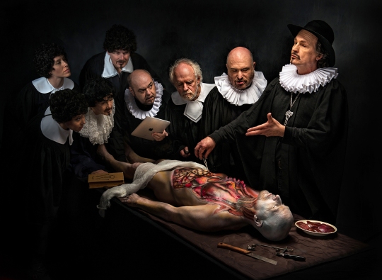
This version of Derek’s Anatomy Lesson has an extra surprise in form of an iPad used by one of students (Derek playing the role himself).
Rembrandt’s famous painting Anatomy lesson of Dr Tulp was one of Derek’s early inspirations. Rembrandt’s brilliant group portrait was commissioned by medical doctors. Each of them paid a part of a fee and each expected to be depicted with equal prominence. Instead of featuring passively sitting or standing individuals, Rembrandt broke with tradition, choosing the scene where subjects participate in the action of a moment. Rembrandt’s revolutionary vision has a distinctively photographic quality: a photo-like dynamic scene with action frozen in time. Derek’s Anatomy Lesson relates to these narrative qualities of the masterpiece. Spectators eagerly leaning towards the corpse are in fact Derek’s friends from Victoria’s art scene, who helped him with production of the image. This is their portrait, executed with “Rembrandt style” chiaroscuro and “Rembrandt lighting” commonly utilized in fine portrait photography.

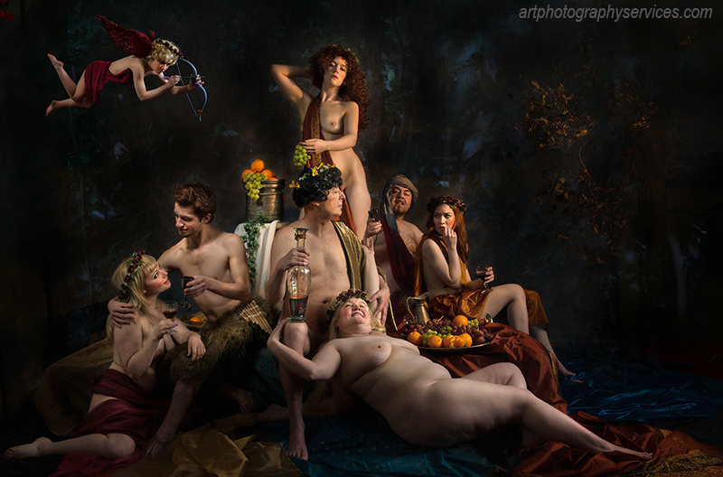
Bacchus, Pan, and Ceres – medalist at London International Salon of Photography 2013, in UK, and a Gold Medal winner at 151st Edinburgh International Exhibition of Pictorial Photography 2013, in UK.
With lighting assistance by Jon Hoadley.
All models from Victoria, Canada. Top left: Chrisscreama, Standing Center: Walking dreamer, Bottom left: Aleta Eliasen, Daniel Corbett, Michael Ward, Derek Galon, Chrisscreama again (far right), Model in front: Kim Brouseau
Derek’s Bacchus, Pan and Ceres is another complex image, full of compositional challenges. It is inspired by bacchanalia scenes painted by Titian for the palace of Duke Alfonso d’Este. Titian referred to these paintings as “poesie”, a visual equivalent of poetry. The scene on Derek’s photo shows a hedonistic, merry company of the wine god Bacchus, Ceres – goddess of fertility and agriculture, with Pan – the huffed god of wild nature and their friends. This mythological scene with strong erotic elements is also humorous and witty, it has a fun-filled touch to it, and a sensitively chosen colour palette.
“Creating and photographing these group scenes has lots of challenges”, comments Derek. “Painters often interpret perspective or lighting rather loosely. They can bend reality to create most dynamic and impressive scenes. In a photo studio with a group of models, problems are many: unwanted shadows often cover people closely standing together, or sometimes the perspective of the background does not go together with dynamics of the front composition which may require a slightly different focal length. It takes forever to set the right lighting using many strobes, and trying to make it look very simple and natural.”
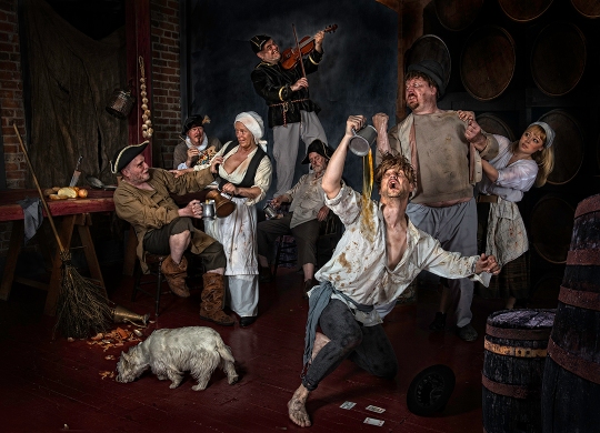
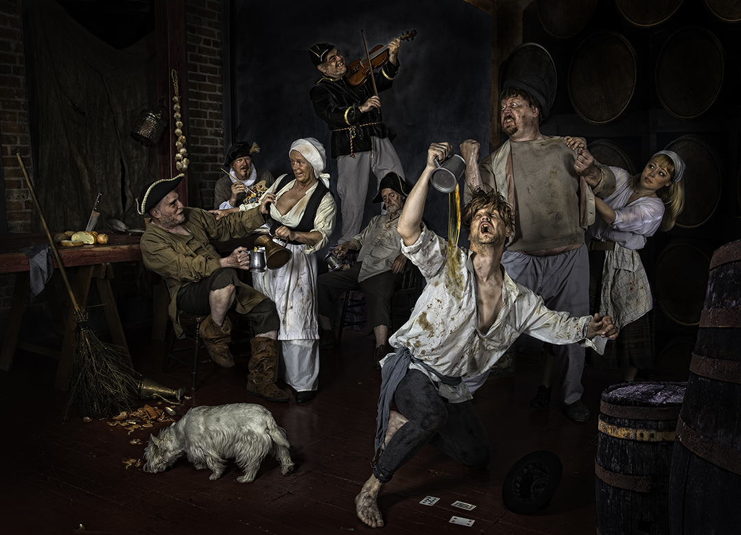
A.Brouwer Paints His Tavern Scenes.
From left: Herman Surkis, Tom Gore, Dasty Hughes, Derek Galon, Jon Hoadley, Carl Constantine, Mike Hebdon, Aleta Eilasen, (+ Sally The Dog). Makeup – Aleta, props – Derek, Costumes – Dusty + Disguise The Limit, lighting consultation – Jon Hoadley.
One of the most challenging images to make was the Tavern based on genre paintings depicting scenes of everyday life, especially art of Adriaen Brouwer, Flemish artist of the 17th century. Brouwer himself felt very comfortable in taverns and often painted the peasant and “low life scenes” he witnessed. Like Brouwer’s work, Derek’s Tavern is full of movement and action. Portrait-like characters are engaged in complex interaction. Their faces are expressive, even slightly grotesque. Derek cannot resist in joining the merry company and playing a fiddle. His image is full of good-natured humour, and created with visible care for detail. The colour palette made of warm translucent browns and greys is well blended into the atmosphere of the whole. As Brouwer sometimes used his friends – painters, to model for him, Derek once again invited his friends from Victoria’s art photography scene to model for this image. One of the models actually depicts Brouwer himself, painting the vivid scene before him and clearly enjoying it.

The Knight Of Might with the fine Michael Ward from Victoria – model.
While Derek’s Tavern makes you reach for a glass of beer, his Knight of Might stirs very different emotions. We see a gnarled man whose face is weathered, the skin of his face rough. Although his armoured body looks powerful and mighty, he looks exhausted, sensitive and vulnerable. He’s holding a lady’s handkerchief – is this the reason he looks so pensive? For how long he’s been separated from his loved ones, how much pain did he endure during his voyage? We’ll never know. Dark reflections of moonlight correspond with his brooding, inner landscape of the soul. This image was inspired by romantic paintings by John William Waterhouse. To successfully create specific mood and atmosphere of the image, Derek relays on models’ ability to deliver the best acting performance. Their creative output is vital to the success of the image. Here, Derek was aided by his longtime friend and a professional art model Michael Ward.

The Passing – Pieta.
With Michael Ward and Stephanie Kingston.
Michael is also involved in another atmospheric image called The Passing – Pieta inspired by paintings of similar subjects by Michelangelo and Titian. Young woman mourning over the body of a dead man; his pale glowing flesh accentuates the feeling of sorrow and loss. The background of a derelict church reflects the feeling and mood of the piece.
Further exploration of darker themes brings Derek’s fascination with one of the most timeless and haunting Nightmare paintings by Henry Fuseli. Although having a different concept, also very Gothic and Freudian, Derek’s Monstrous Deception

Monstrous Deception – tribute to Nightmares by Henry Fuseli. With Brandy Sapala, Derek as the monster, and Callum Shandley as the mirror reflection.
is equally scary. Like in Fuseli’s painting, the scene is made of gradual realizations; we need time to fully understand the horror. The young man kissing the girl is only a pretender. In fact, he is this shady monster-like creature who stares at us from darkness. His facial expression implies his annoyance with viewers for discovering his deception, while the lady on front of him seems to be unaware of it, falling into his trap. The scene is dramatically timed, slowly unfolding to show us additional, perhaps intentionally hidden details. Only 27 years after Fuseli painted his last version of the story, Mary Shelley wrote the famous piece of Gothic literature – Frankenstein.
“Creating interaction and a narrative story in a similar way to paintings is yet another challenge. Old canvasses often have symbolic details and secondary interactions or meanings, which can be discovered as you take time to study a painting. Such multi-level dynamics require not only a fine planning and preparation, but also good acting skills of all the models, great concentration during the shoot and lots of patience. Many of my ready images are actually combined from best parts of several shots, like a jigsaw puzzle assembled of the most attractive elements picked from the whole session. Finely painted flying cherubs, angels, or special effects dazzling us on old masterpieces, require much planning and meticulous photo editing and I wish I could just paint them on my photos instead.”
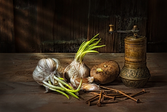
Brown Over Green – Still Life. A tribute to paintings by Chardin.
Derek’s still life image Green Over Brown brings a different mood. Without the drama of other photographs in this series, it depicts a simple world of austerity and calm. You almost need to slow yourself down to appreciate it. Inspired by masters of still life, especially Chardin and Spanish “bodegon” painters, it shows the beauty of everyday objects that surround us. The items portrayed were selected not for their allegorical vanitas meaning but for their shapes, textures and colors. The objects are gradually emerging from the subtly toned background.
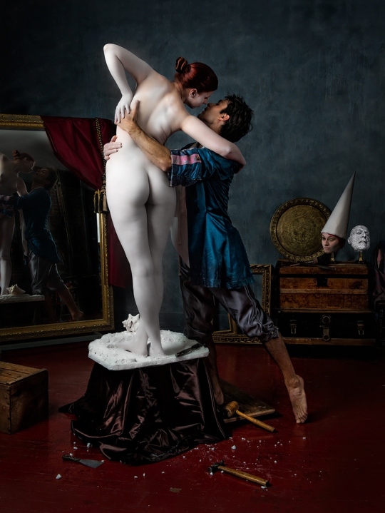
Pygmalion – a tribute to Jean Gerome, one of Derek’s favourite old masters.
Xevv McModel and Brandon L. – models, makeup/body paint by Aleta Eliasen, light consultant – Jon Hoadley.
Jean-Leon Gerome, the prominent artist of Orientalism movement, was a keen follower of photography and adopted this new media for his work. He was an indefatigable traveller to the Middle East, frequently accompanied by a photographer. Gerome’s technique was of impeccable precision, and some of his paintings have almost visual reality and crispness of Photorealism. Derek’s Pygmalion drew inspiration from Gerome’s versions of the mythological story of Pygmalion, an artist who fell in love with the sculpture he created. The image depicts the moment when the sculpture of Galatea is brought to life by Pygmalion’s kiss.
“For me, masterpiece paintings are the source of limitless inspiration. No matter how fancy our digital imaging will get, old canvasses will never stop thrilling us” – says Derek. “Photographing architecture and landscape foran everyday living, I return to my world of art images like to my sanctuary, and I treasure every moment of this work. Now, with my art winning medals, getting internationally exhibited and sold, it gives me even more motivation than ever to continue.”
by Margaret Gajek, MA, writer, researcher, art historian, co-founder of Ozone Zone Books
All images copyright Derek Galon. Please respect our copyright. Thank you.
Derek’s art prints (limited editions and open editions) are available directly by contacting him at:
derek (at) ozonezonebooks.com or from the Gallery Vibrante.Thank you, until next time – we hope you enjoyed this post! If you did, please FOLLOW us, click SHARE and show it to your friends.

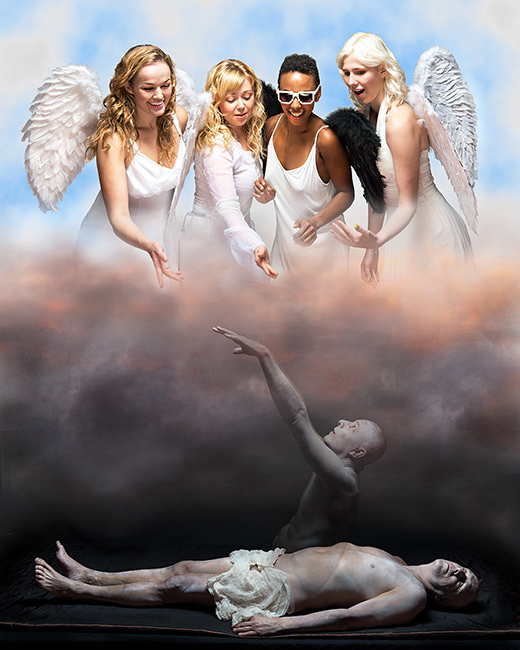
Taken By Angels – Derek Galon’s more contemporary, light-hearted and humourous image taking from old canvas masters. With Michael Ward, Sharon Ace, Aleta Eliasen, Karissa T. and Jen Wright – models. Makeup – Aleta Eliasen.


 et
et


